GOLD - COMMODITY

07/04/2026
In Lesson 5 you set up your TradingView. You added the moving averages, configured your Fib, and got your chart looking the way we trade. Now let's use all of it on a live chart - for the very first time.
This is Gold. And right now, it's one of the most talked-about charts in the world.
Why Is Gold Moving?
Gold has always been where people run when the world feels uncertain. Wars, recessions, political chaos - money flows into gold when people don't know where else to put it.
Right now, the world has a lot of uncertainty. The US-Iran conflict has disrupted global oil supply. New trade tariffs are being announced almost weekly. Stock markets are shaking. And when all of that happens at once, gold tends to move - and move fast.
That's the news behind this chart. Keep that in mind as we look at what the candles are actually doing.
Open Your Chart
In TradingView, search for XAUUSD and select Gold Spot / U.S. Dollar from OANDA. Set your timeframe to 1D (daily) — we're starting zoomed out this time before we work our way in.
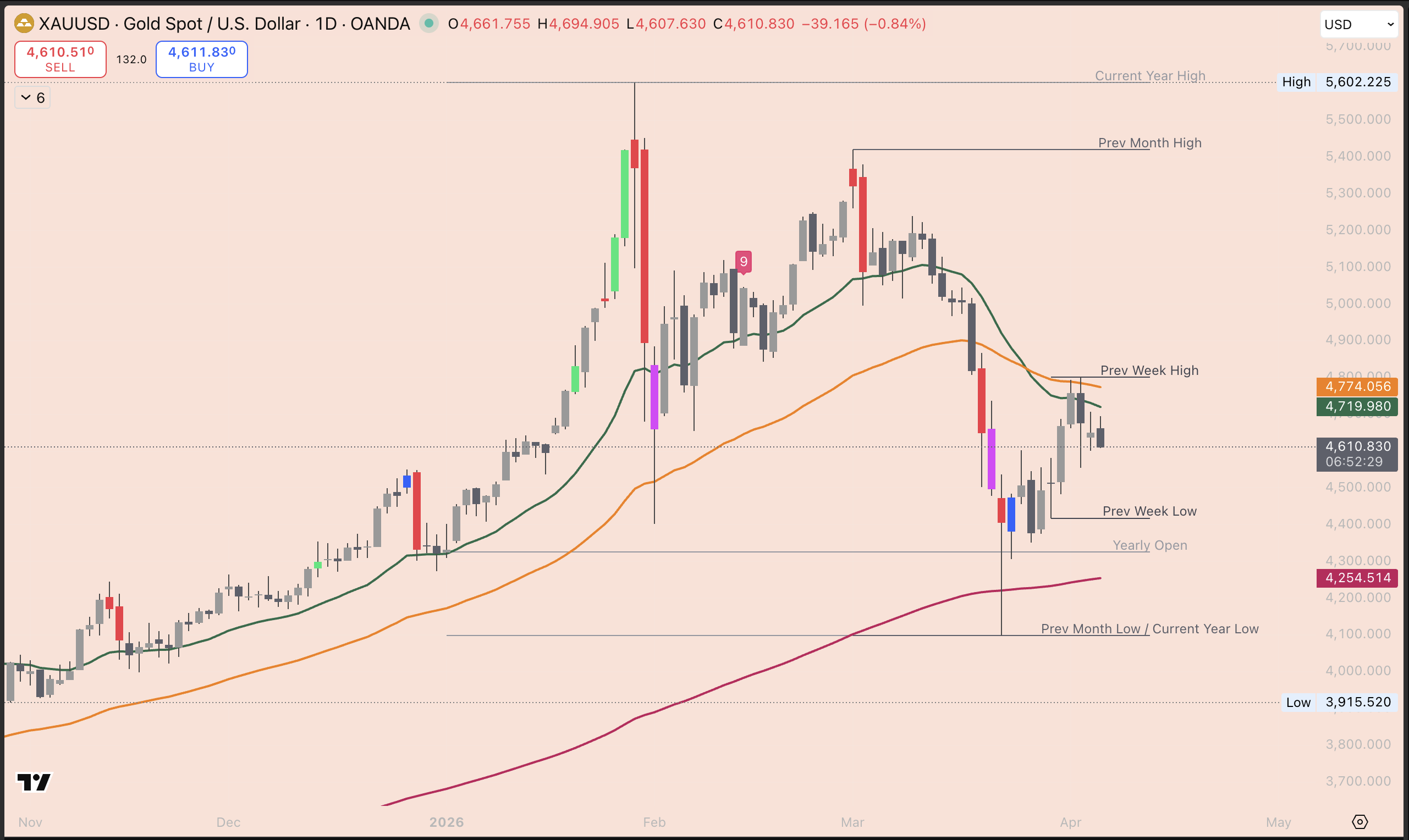
Start Here: Zoom Out to the Daily Chart
Before we look at anything else, we need to zoom out. Switch your timeframe to 1D (daily). Each candle now represents one full day, and from up here, the big picture becomes a lot clearer.
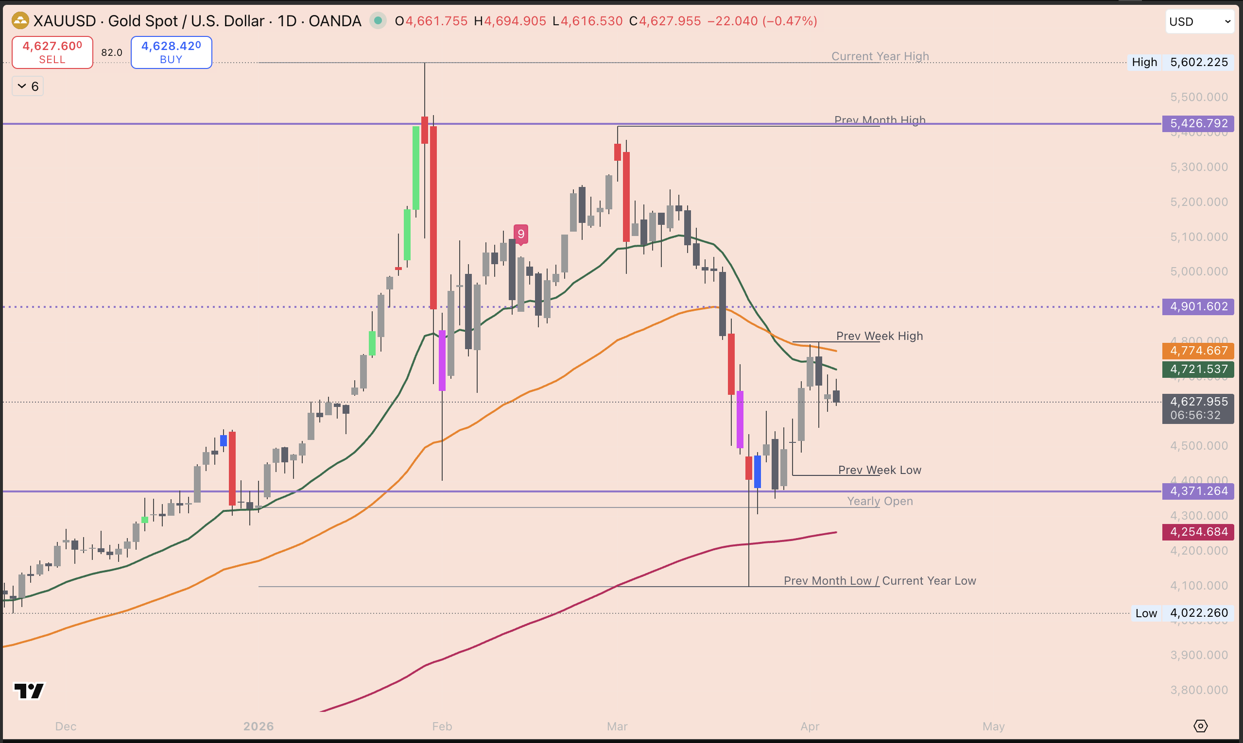
The first thing we do on any chart is find two things: support and resistance.
Support is the floor: a price level where buyers have historically stepped in and stopped the price from falling further. On the Gold daily chart, that level is the solid line at $4,371. That's our floor.
Resistance is the ceiling: a price level where sellers have historically stepped in and stopped the price from going higher. On this chart, that level sits up at $5,427. That's our ceiling.
Everything that happens in between those two levels is just price moving around inside the room. Right now, Gold is trading at around $4,658 - which means it's sitting in the lower half of that range, closer to the floor than the ceiling.
You'll also notice a dotted line sitting roughly halfway between the two at $4,901. That's the midpoint of the range. It's worth knowing because price often pauses or reacts around the middle before deciding which direction to go next.
Once you can see the floor, the ceiling, and the midpoint - you already know more than most people looking at this chart. Now switch back to 4H and let's dig deeper.
What the Moving Averages Are Telling You
Remember in Lesson 5 when we said: green above orange, orange above red = trend is up?
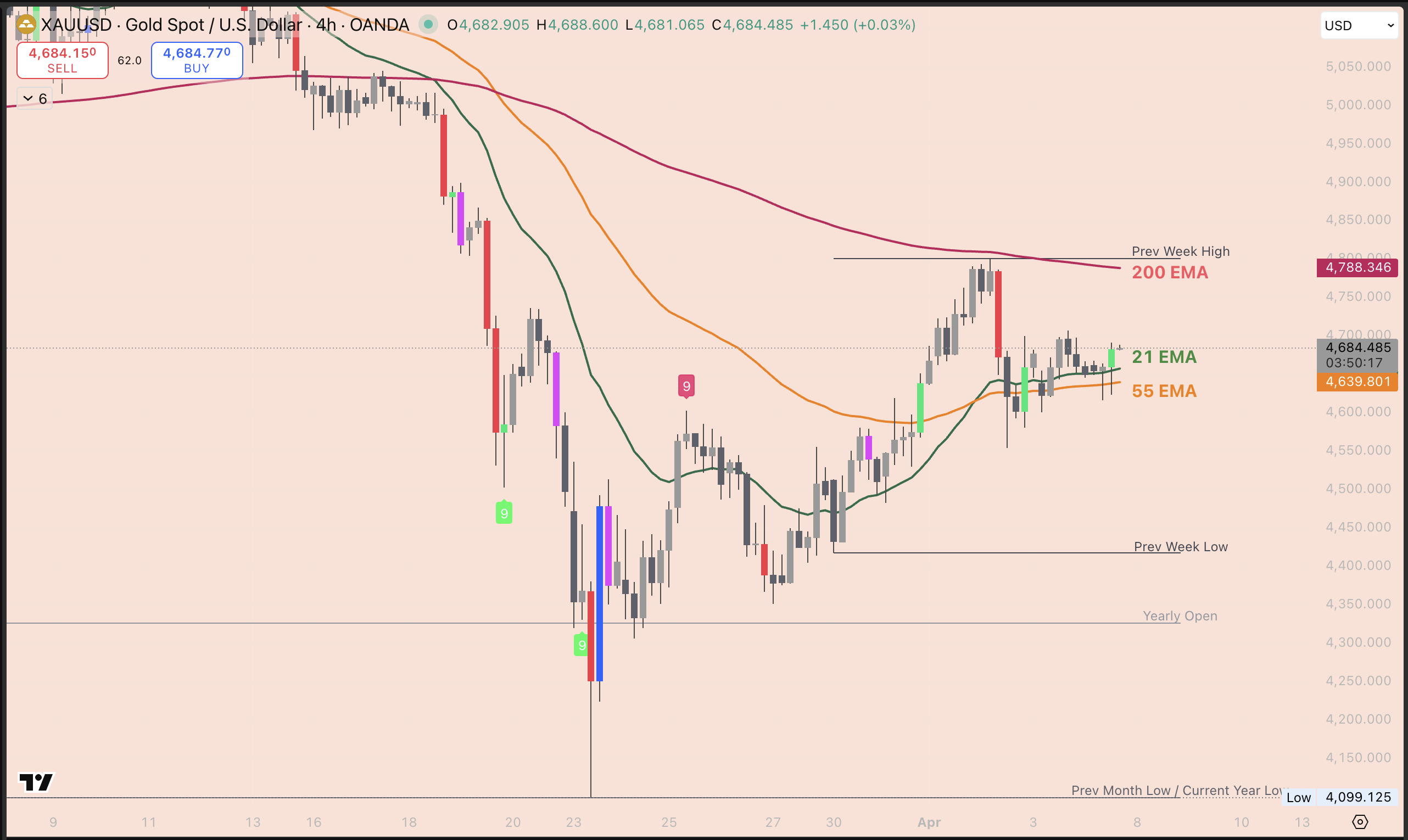
Look at your chart now. That's not what you're seeing.
The red line - the 200 EMA, the one that moves slowest and tells you the big picture - is still curving downward and sitting well above the current price. That tells you the longer-term trend on Gold is still pointing down.
But here's where it gets interesting.
After a massive drop from around $5,400 all the way down to $4,100, Gold has stopped falling. The candles have found a floor. And in the last few days, the green and orange lines have started turning upward. That's the first sign that momentum may be shifting.
The moving averages are showing you a battle in progress. The big trend (red) is still down. But the shorter-term trend (green and orange) is starting to push back up. This is called a recovery, and it's one of the most important things you'll learn to spot on a chart.
What the Fib Is Showing You
Now draw your Fib on this chart. Remember in Lesson 5, we are looking for a clear wave. This time we're drawing from the bottom up, because Gold has already made its low, and we want to understand the bounce.
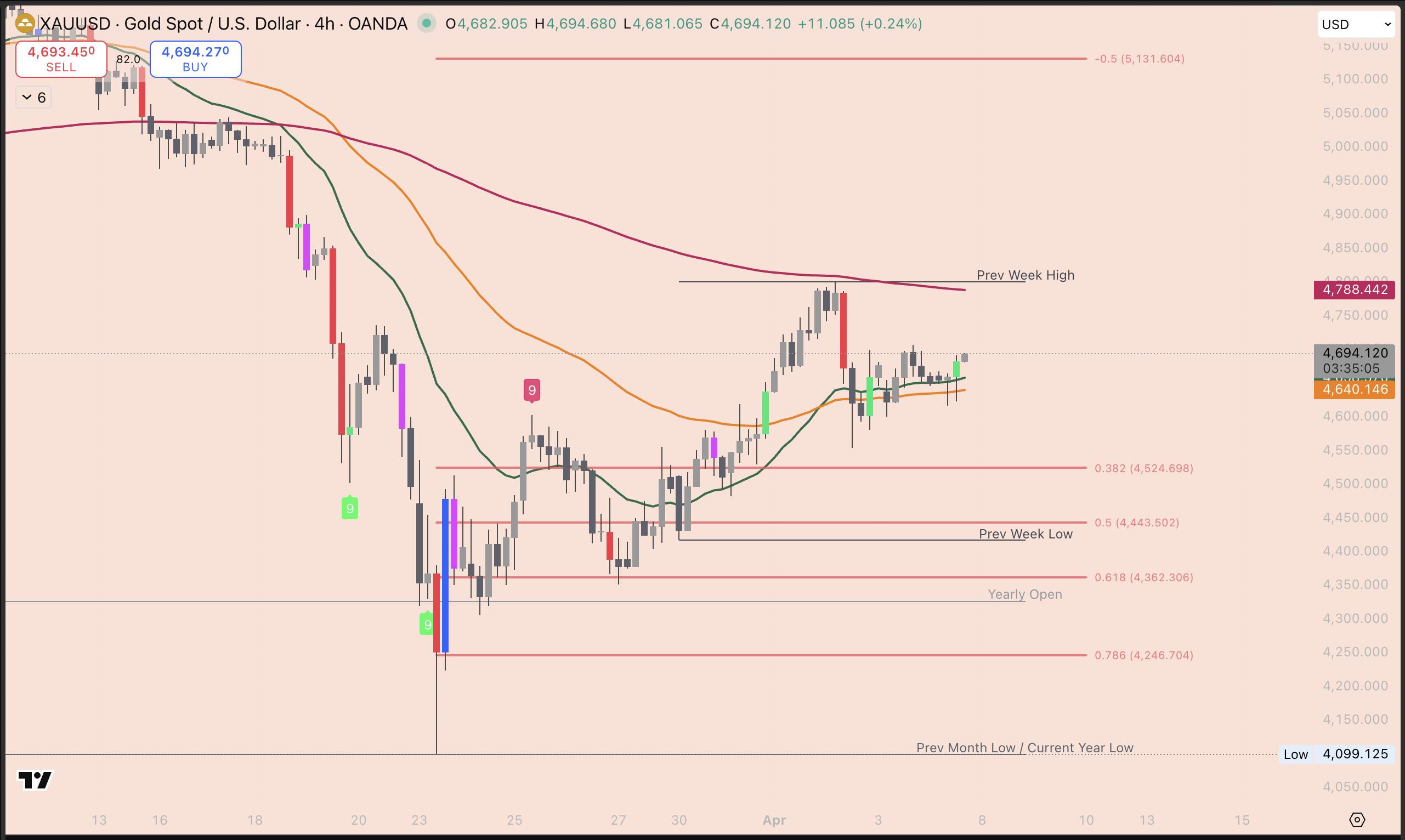
Find the current year low at $4,099 - that's your starting point. Drag up to the most recent high around $4,789. Click the low first, drag to the high, and release.
Your Fib levels will land at:
- $4,523 the 0.382 level: The first zone where price could pull back to after the bounce.
- $4,442 the 0.5 level: The halfway point. A deeper but still healthy pullback. Notice the previous week low sits almost exactly here too, when two separate reasons line up at the same price, that level carries more weight.
- $4,361 the 0.618 level: This is the golden pocket - the zone traders watch most closely. A pullback here and holding would be a strong signal.
- $4,245 the 0.786 level: The deepest meaningful zone. If price gets here, the bounce is being seriously tested.
Current price is sitting around $4,641 - hovering above the 0.382 level. The Fib is now your map. Those levels below are the zones worth watching if price pulls back before its next move up.
The Line That Changes Everything
Now try drawing a trend line on your chart. Go back to Lesson 5, select the trend line tool from the left toolbar, and connect the highs from left to right.
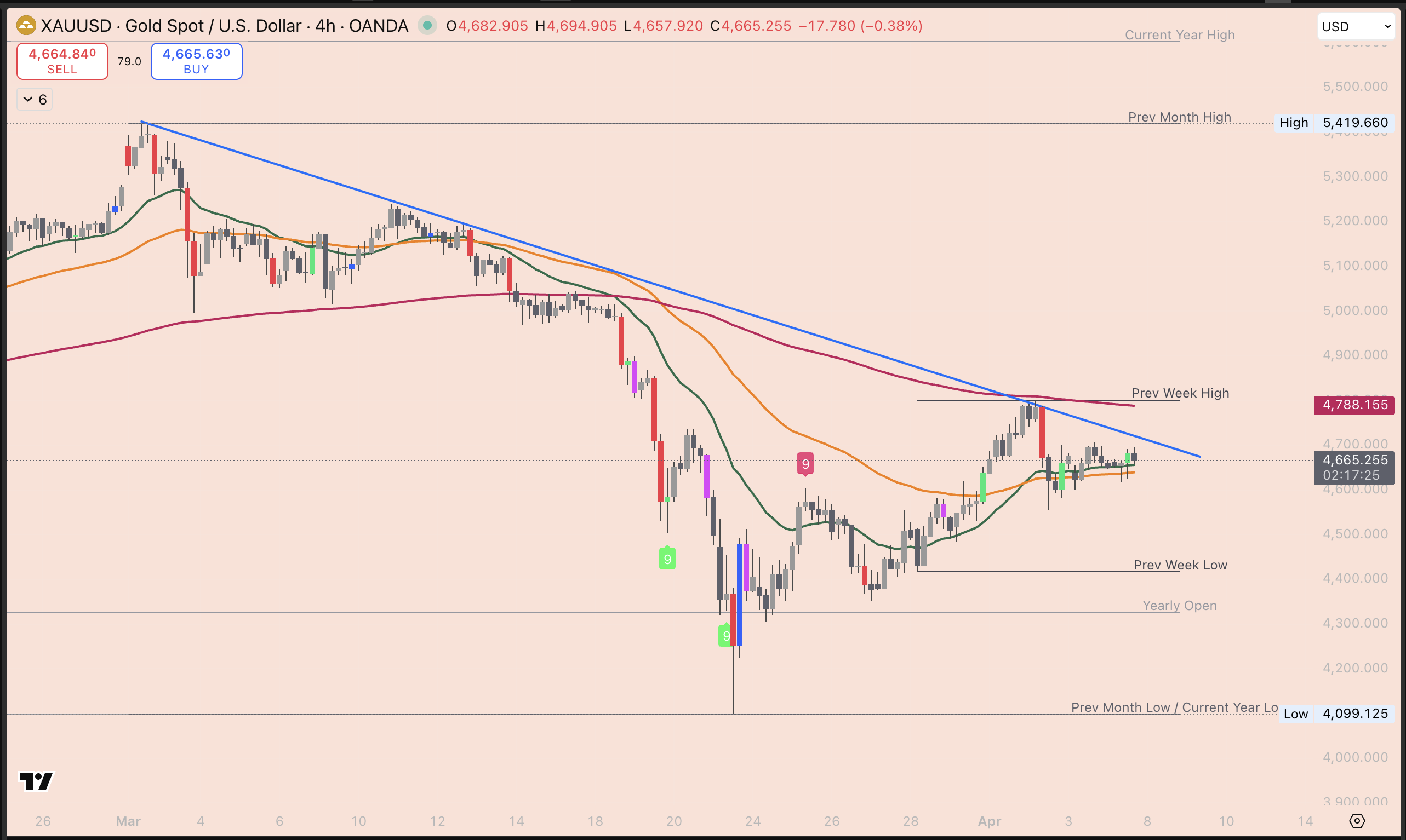
Start from the previous month high around $5,419, then connect it through the series of lower highs as price came down. You'll end up with a diagonal line sloping downward - this is called a descending trendline. It's the market making lower and lower highs over time, which is the definition of a downtrend.
Here's why this matters right now: current price at $4,688 is sitting right below that line.
That line has been acting as a ceiling for weeks - every time price approaches it, sellers push it back down. Until we see strong green candles closing clearly above it, the downtrend is still in control.
That's the thing to watch above everything else this week.
Your First Trade Idea - How to Think About It
This isn't an instruction to trade. It's your first time walking through how a trade idea actually forms - using the tools you just learned.
Here's how we'd think about Gold right now:
The big red line (200 EMA) is still pointing down and sitting well above price. That means the longer-term trend is still against us for a long trade. We don't fight that.
But the green and orange lines are turning upward, and price has bounced strongly off the year low. So we watch and wait. What we'd want to see is price pull back into one of those Fib zones - the $4,442–$4,523 area or deeper toward the $4,361 level - hold there, and then show signs of pushing back up. That's when the moving averages and the Fib are working together, and the picture starts to get clearer.
If price breaks back below $4,245, the recovery is in serious trouble. If price holds the Fib zones and the green line stays above orange, the bounce has legs.
Two scenarios. Two outcomes. That's how every trade idea starts.
Mom Tip: Open Gold on your TradingView right now, draw that Fib wave from $4,099 up to $4,789, and find those four levels on your chart. Then just watch what the candles do around them over the next few days. You're not placing a trade, you're learning to read the map. That's the whole game right now.
The content in this post is for educational purposes only and reflects our personal perspectives on the market. It is not financial advice. Always do your own research before making any trading decisions. We are sharing our ideas — not telling you what to do with your money.